01. Project
UX UI Design / Branding
Atato is a digital asset custody solution that supports any crypto currency.
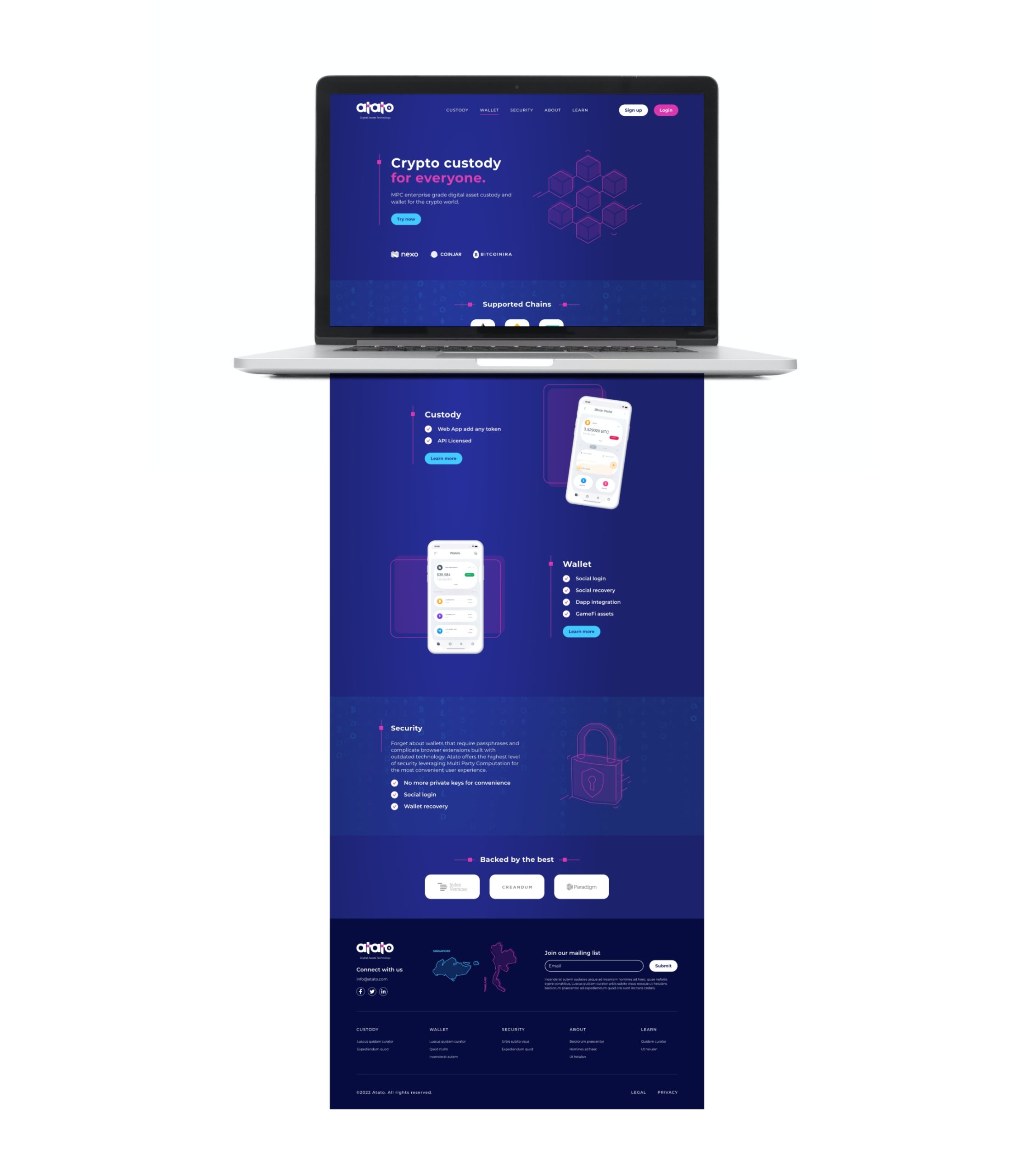
They needed me to create a logo, an original and impactful brand identity and a website to present their offer.
Objectives
This brand identity had to be created with the company’s target audience in mind: young people with a passion for technology and innovative projects.
Restrictions
Adapt to technical development constraints, the team of 5 people already in place and the very tight schedule of the project.

02. Process
In the end, the working process was pretty straightforward: good brainstorming, a good understanding of the targets and the crypto universe.
From there, I imagined a logo and defined the atmosphere I wanted to recreate. I started from the premise that we’d be creating a site with a dark background, so I needed bright, vivid colors to emphasize the message.
The illustrations I created also served to reinforce the impact and originality of the brand’s universe.
Logo
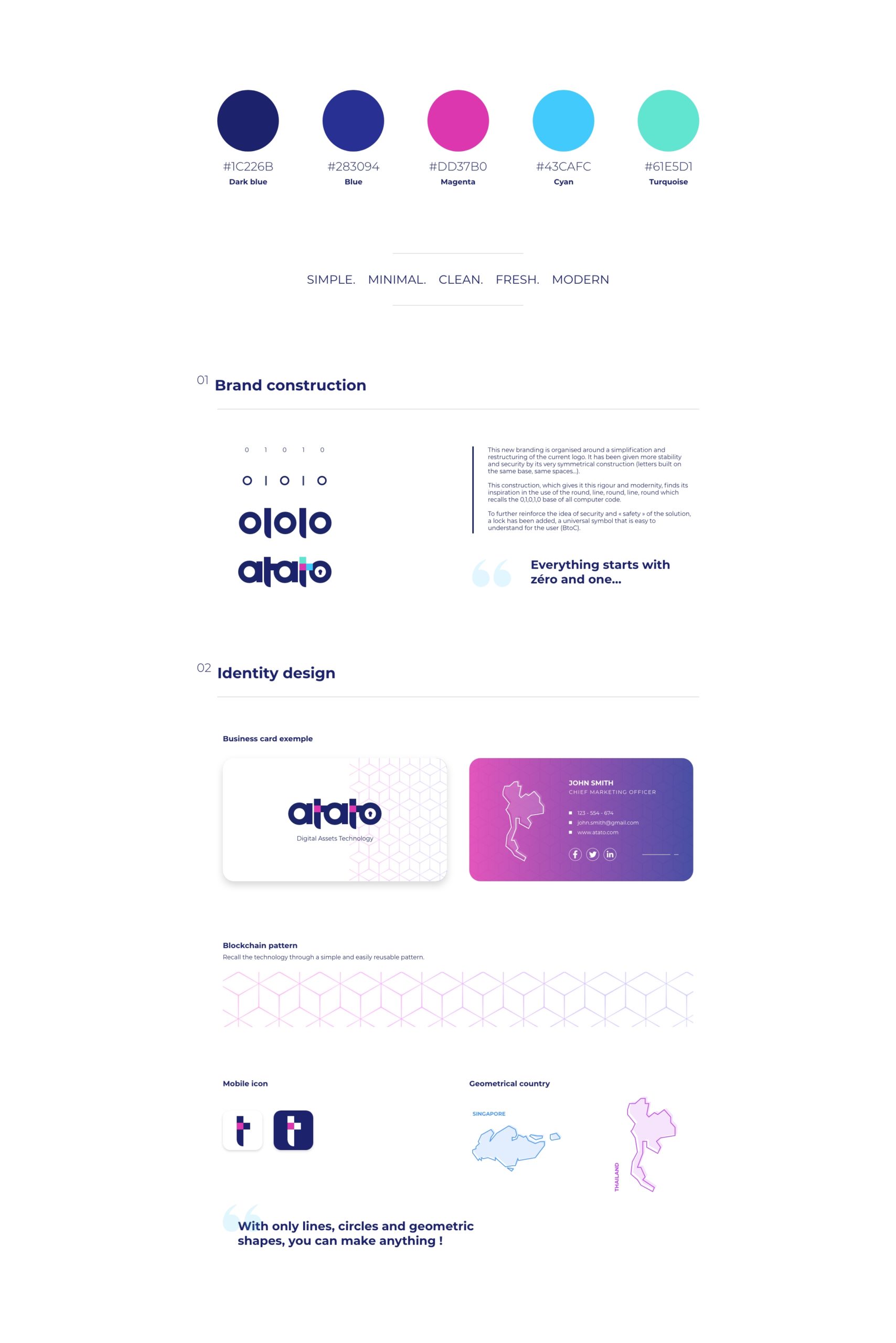
I created a simple logo based on binary code: the origin of all computer code.
It had to be small, work in color as well as in white.
Branding
The brand identity had to be in keeping with the world of crypto-currencies, while being original, impactful and quickly identifiable.
Illustrations
For the occasion, I created isometric and clear-line illustrations that bring the message to life and create a world of their own.

03. Results
The result is, I think, quite convincing.
The client quickly fell in love with the design and colors I proposed, which enabled us to meet the deadline and have the logo, graphic charter and site design ready in a month!


